November-December 2024
Background
In today’s high-pressure environments, many professionals and students are navigating an ongoing struggle to maintain their mental and emotional well-being. While mental wellness tools are increasingly accessible, they often feel impersonal, time-consuming, or difficult to integrate into daily routines, leaving users unsupported when they need it most.
Problem
User research revealed that many individuals seek better emotional balance but feel overwhelmed by existing wellness apps. These tools often demand more time and cognitive energy than users can afford, especially when they’re already experiencing stress or burnout. There is a gap in the market for a simple, supportive, and low-effort wellness tool that feels personalized and emotionally relevant without adding to users' mental load.
Solution
Glöa was designed to offer emotionally grounded support through personalized features that blend seamlessly into everyday life. With guided meditations, journaling prompts, habit tracking, breathing exercises, and interactive notifications, the app encourages sustainable wellness routines. By focusing on clarity, ease of use, and emotional resonance, Glöa helps users build consistent habits that support their mental well-being without demanding more from them.
TEAM
Team of 4
ROLE
UX Designer, Team Lead
Tools
Figma,
FigJam, Trello, Google Forms
Overview
Process


Level 1
Empathize
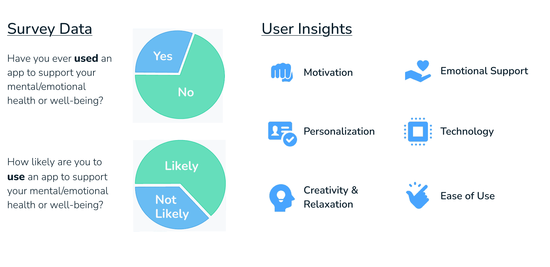
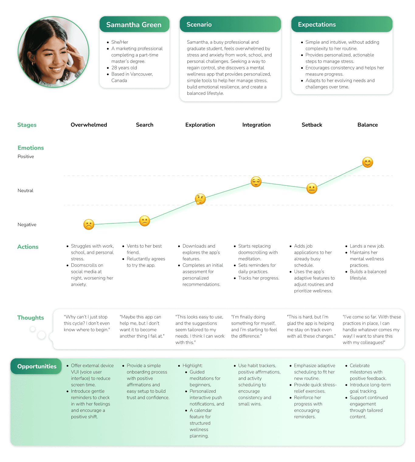
To deeply understand user needs, surveys and interviews were conducted with individuals balancing work, school, and personal demands. Many participants reported feelings of burnout, guilt for neglecting self-care, and difficulty finding wellness tools that truly fit their lifestyles.
A detailed affinity map highlighted core themes:
Overwhelm from digital overload
Desire for emotional support that doesn’t feel clinical
Need for routines that feel achievable and flexible
Preference for tools that encourage, not judge
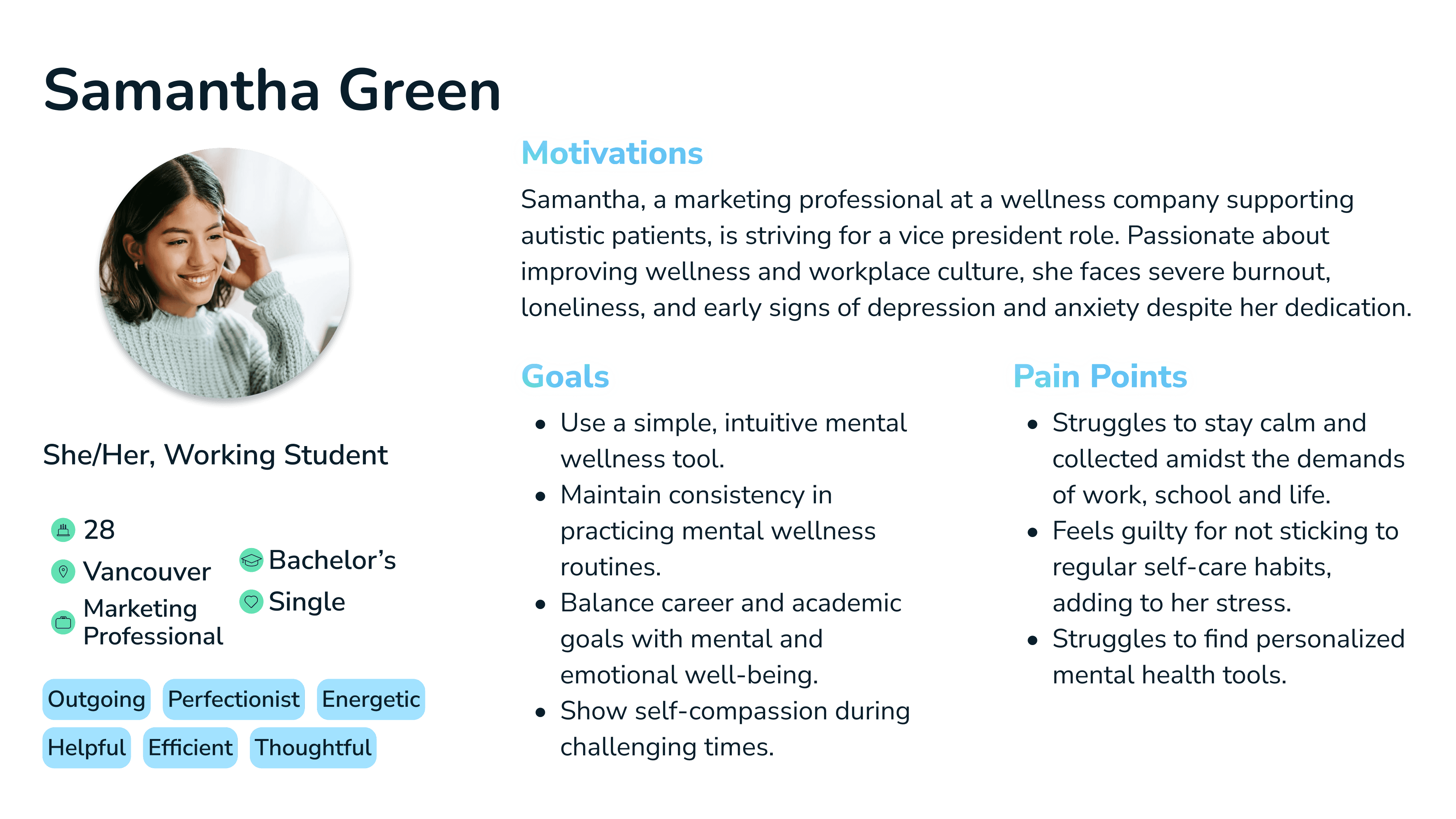
A persona - Samantha Green, a 28-year-old working student and marketing professional - was developed to represent these findings. Samantha’s story reflected a common pain point: the desire to maintain wellness while managing the intense demands of daily life.
View Affinity Diagram

Level 2
Define
The synthesis of user data led to a clear problem statement:
Busy individuals need personalized, emotionally supportive wellness tools that integrate effortlessly into their routines, helping them manage stress and build resilience without adding to their cognitive load.
This statement guided the direction of the design, focusing on simplicity, emotional relevance, and daily integration as key pillars.
Level 3
Ideate
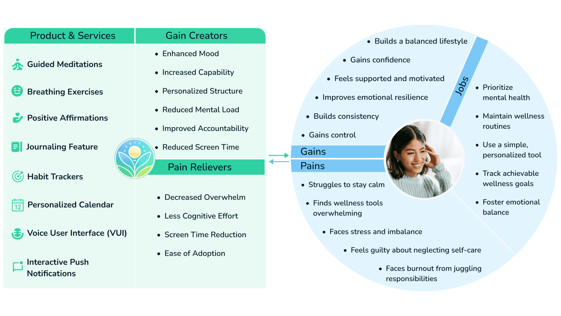
Guided by user needs, ideation sessions prioritized features that could provide support without overwhelming users. Tools such as a priority matrix, value proposition canvas, and user journey mapping helped identify which solutions would be most impactful.
Core ideas included:
Interactive push notifications for habit reminders
Breathing and meditation exercises with voice-guided options
A mood-friendly journaling interface with writing prompts
A personalized calendar for self-care routines
Low-effort goal setting and progress tracking
These features aimed to reduce friction and encourage users to develop sustainable mental wellness habits.
View Prioritization Matrix
Level 4
Prototype
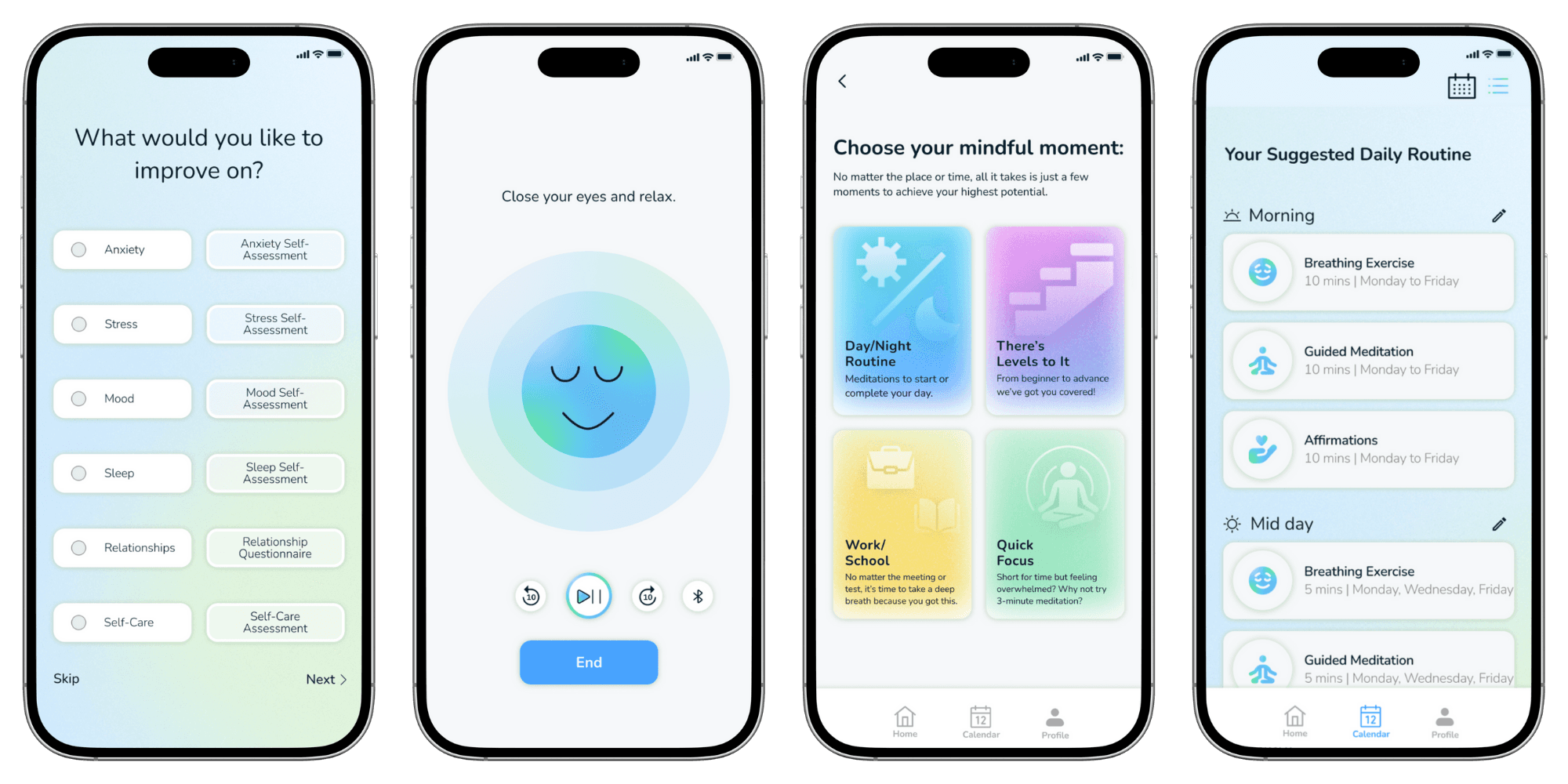
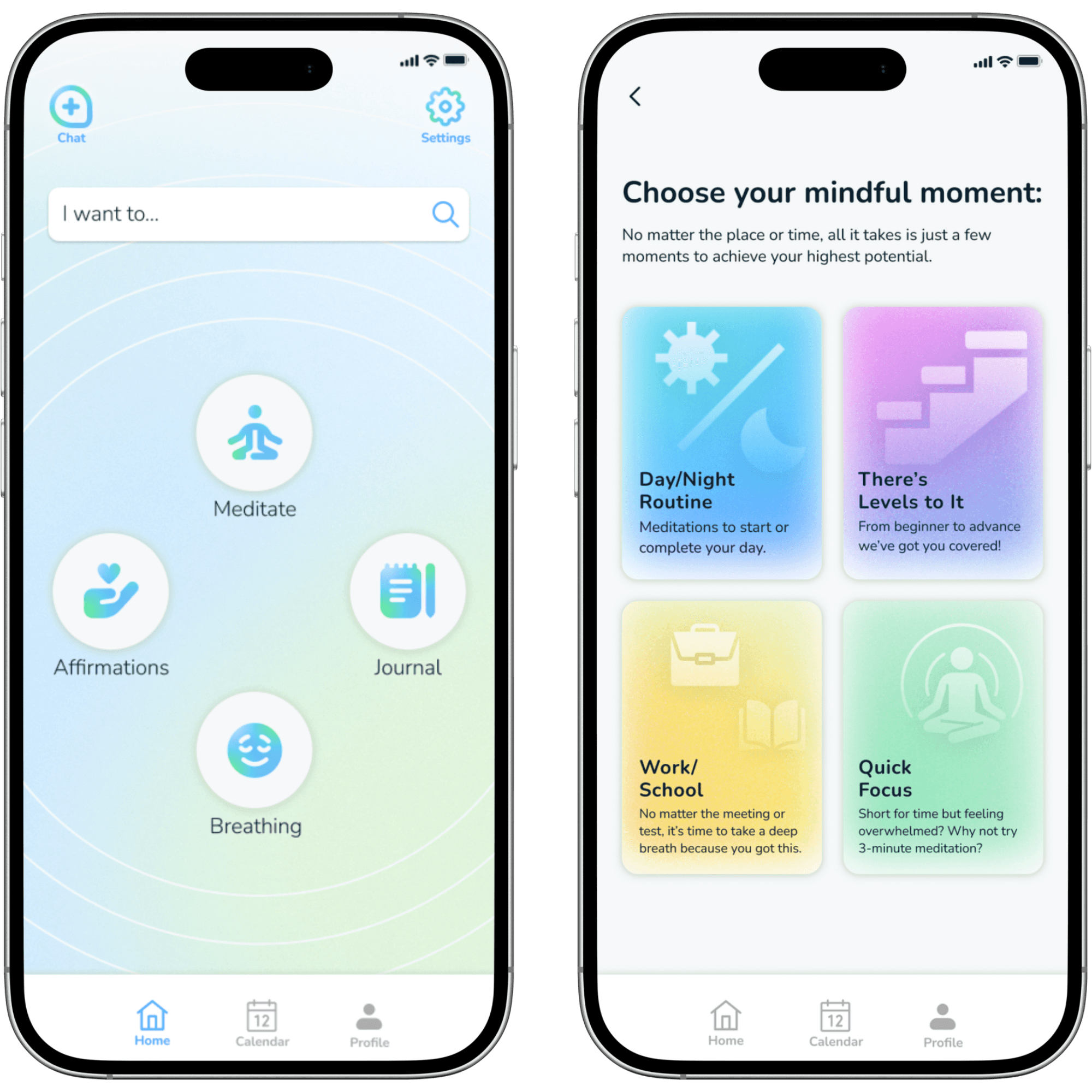
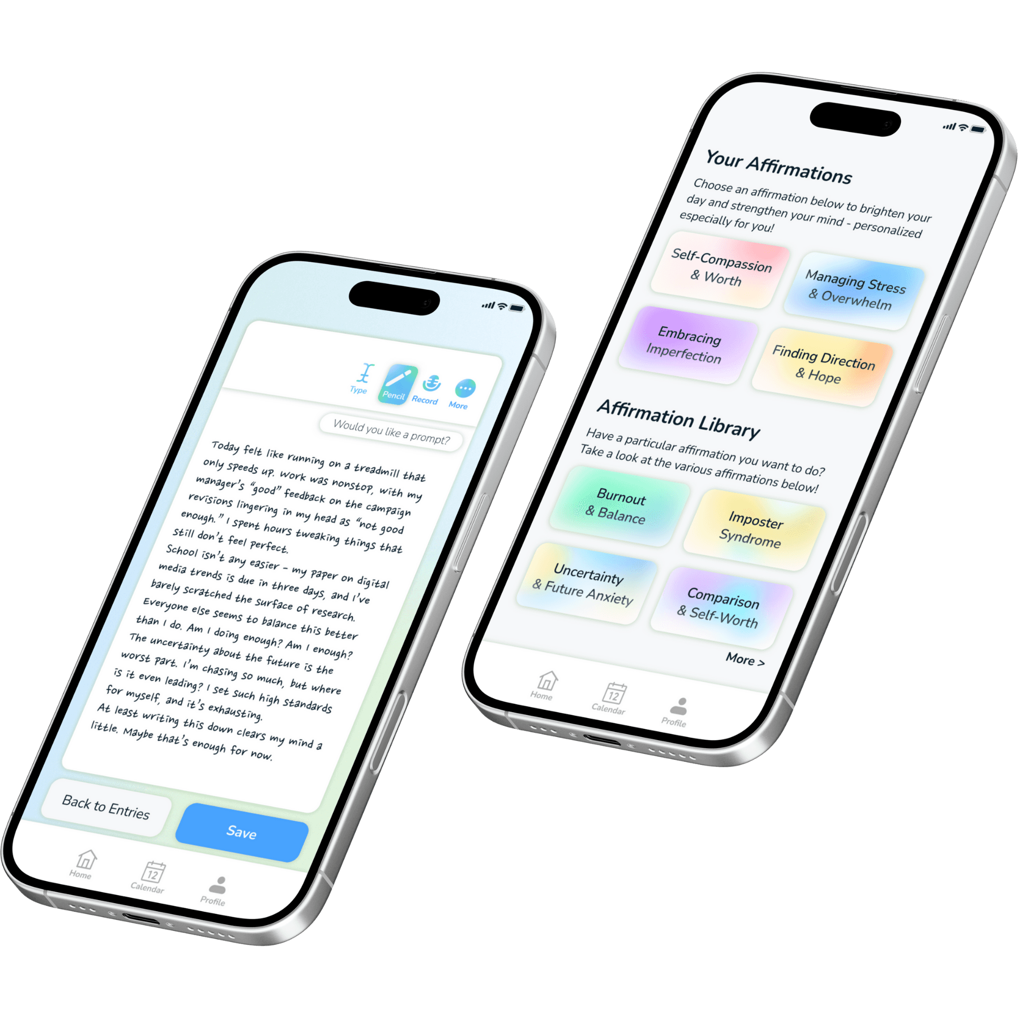
The design phase focused on calm visuals, intuitive navigation, and emotionally supportive language. Wireframes and a high-fidelity prototype were created in Figma, incorporating:
A personalized onboarding flow with wellness goals
Voice-guided meditations and breathing exercises
Journaling with customizable prompts
Progress tracking tools tied to habit formation
Visual clarity and low-text interaction to reduce cognitive strain
The prototype was structured to meet users where they are emotionally and logistically - especially during moments of stress or exhaustion.
View User Flow Diagrams
View Low-Fi Wireframes
View Hi-Fi Wireframes
View Hi-Fi Prototype
Level 5
Test
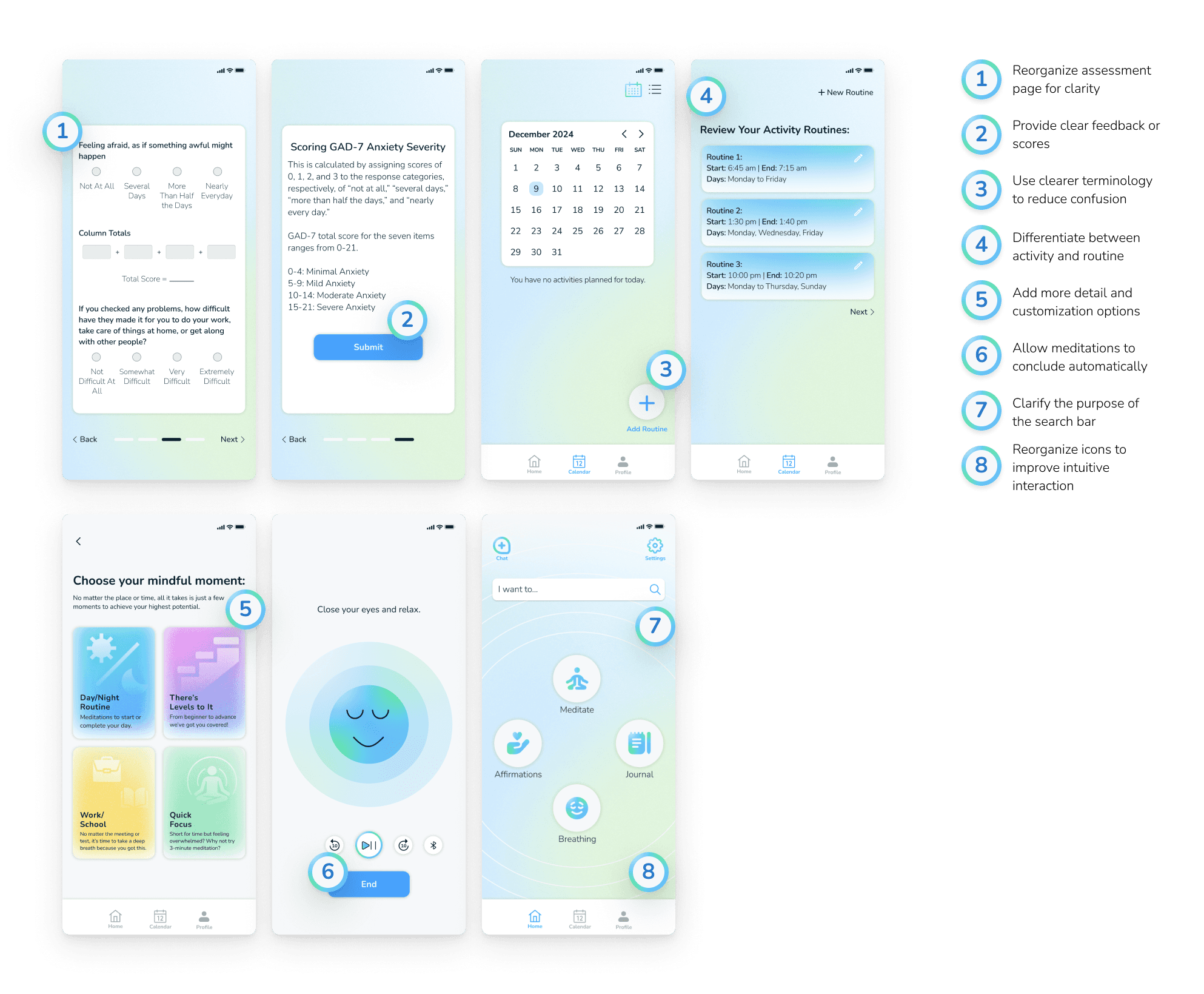
High-fidelity usability testing revealed key areas for improvement:
1) Simplify Assessment Flow
Reorganize the assessment page for clarity, ensuring it doesn’t feel cluttered.
Provide clear feedback or scores after the assessment for better user understanding.
2) Enhance Customization Options
Allow more flexibility for users to create personalized routines and habits.
Add options for customizing the calendar with separate buttons for activities and routines.
3) Improve Routine Setup
Use clearer terminology (e.g., “Daily Habits” vs. “Routines”) to reduce confusion.
Differentiate between adding a single activity and creating a multi-step routine.
4) Enhance Meditation Features
Add descriptions, durations, and levels on the meditation library page.
Remove the “End” button and allow meditations to conclude automatically.
Introduce optional audio or guided meditation functionality.
5) Adjust UI and Icon Placement
Reorganize the placement of calendar, settings, and profile icons for better usability.
Ensure consistency in colour schemes and improve visibility of interactive elements.
6) Clarify Search Bar and Prompts
Clearly define the purpose of the search bar and consider replacing it with a title.
Fix journaling auto-fill prompts to avoid user confusion and provide clear instructions.
Reflection

Broaden User Testing
While initial feedback was insightful, testing with a more diverse and larger user base could have uncovered a wider range of behaviours, accessibility needs, and use cases - leading to a more inclusive and versatile solution.

Depth Over Quantity
Users appreciated the app’s simplicity, but expressed interest in more robust features like advanced journaling, AI-based support, or wearable integration. Future iterations should prioritize deepening core experiences over adding too many surface-level tools.
Balance Speed with Refinement
The tight project timeline encouraged fast, focused progress, but limited the ability to polish finer details such as microinteractions, animations, and visual transitions. With more time, these elements could enhance the overall user experience and emotional tone.

Design for Real-Life Use
Users were most drawn to features that were easy to integrate into their routines. This highlighted the importance of designing tools that reduce cognitive effort and fit seamlessly into everyday life.

Feedback is Essential
Ongoing feedback loops were instrumental in shaping the design. Insights from testing revealed not just usability issues, but emotional reactions - guiding meaningful changes that made the app feel more personal and supportive.