September-October 2024
Background
The Gananoque Arts Network (GAN) is a nonprofit supporting the arts in Gananoque, Ontario. Our team redesigned GAN’s website to better reflect its vibrant role in the arts and strengthen community connections.
Problem
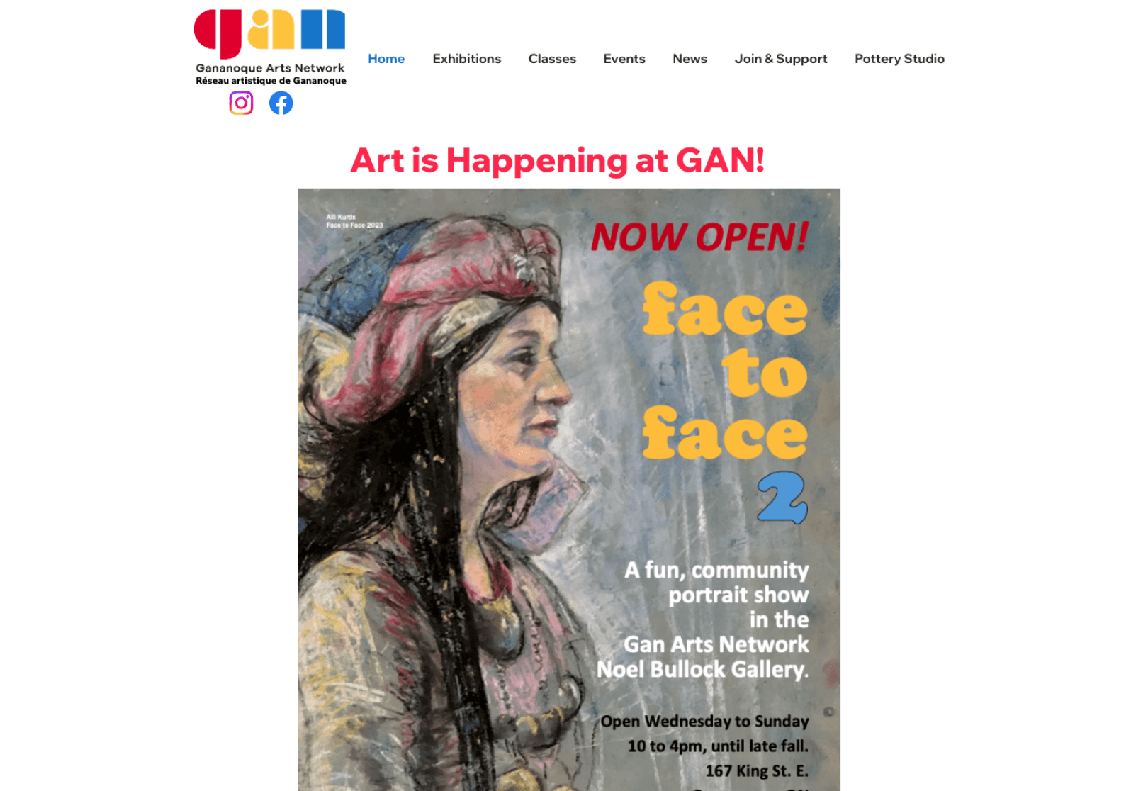
The GAN website’s disorganized layout made it difficult for users to find event information, limiting community engagement and making it harder for art enthusiasts to stay informed.
Solution
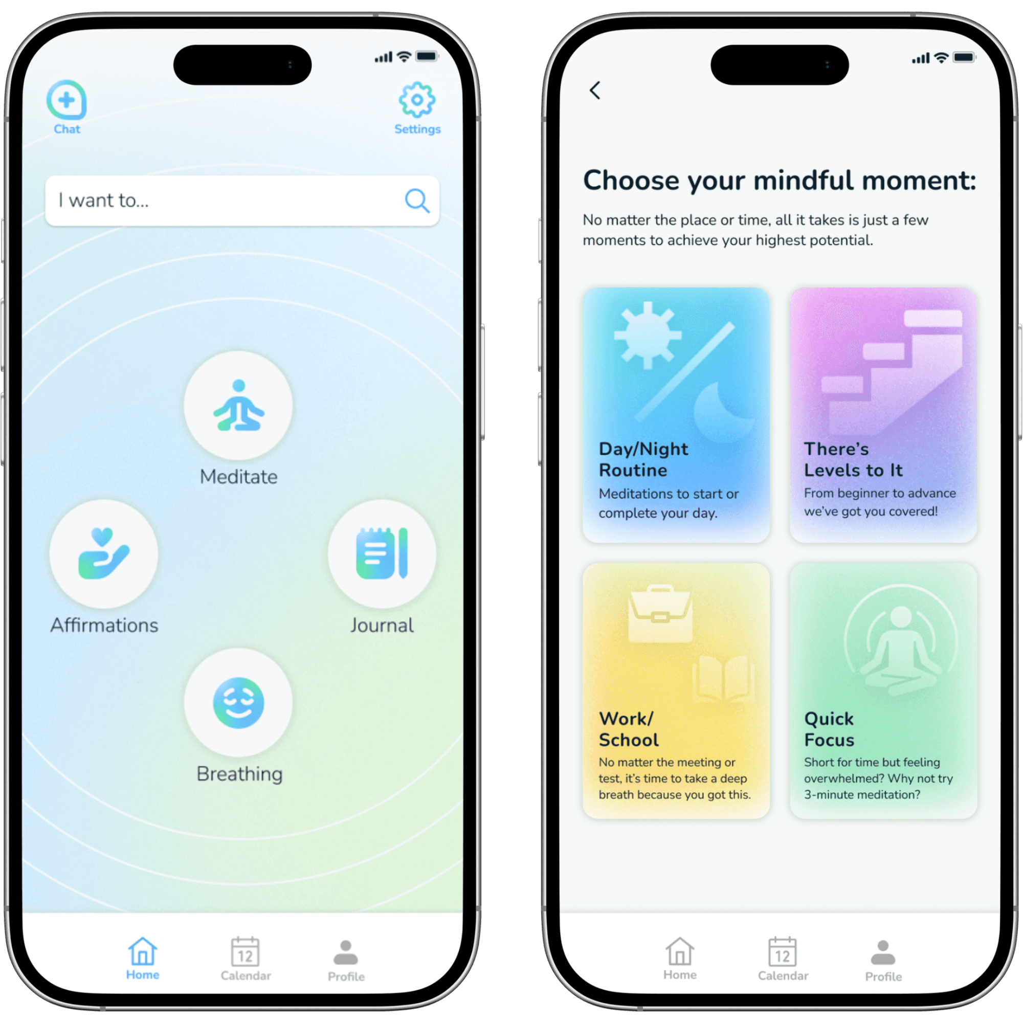
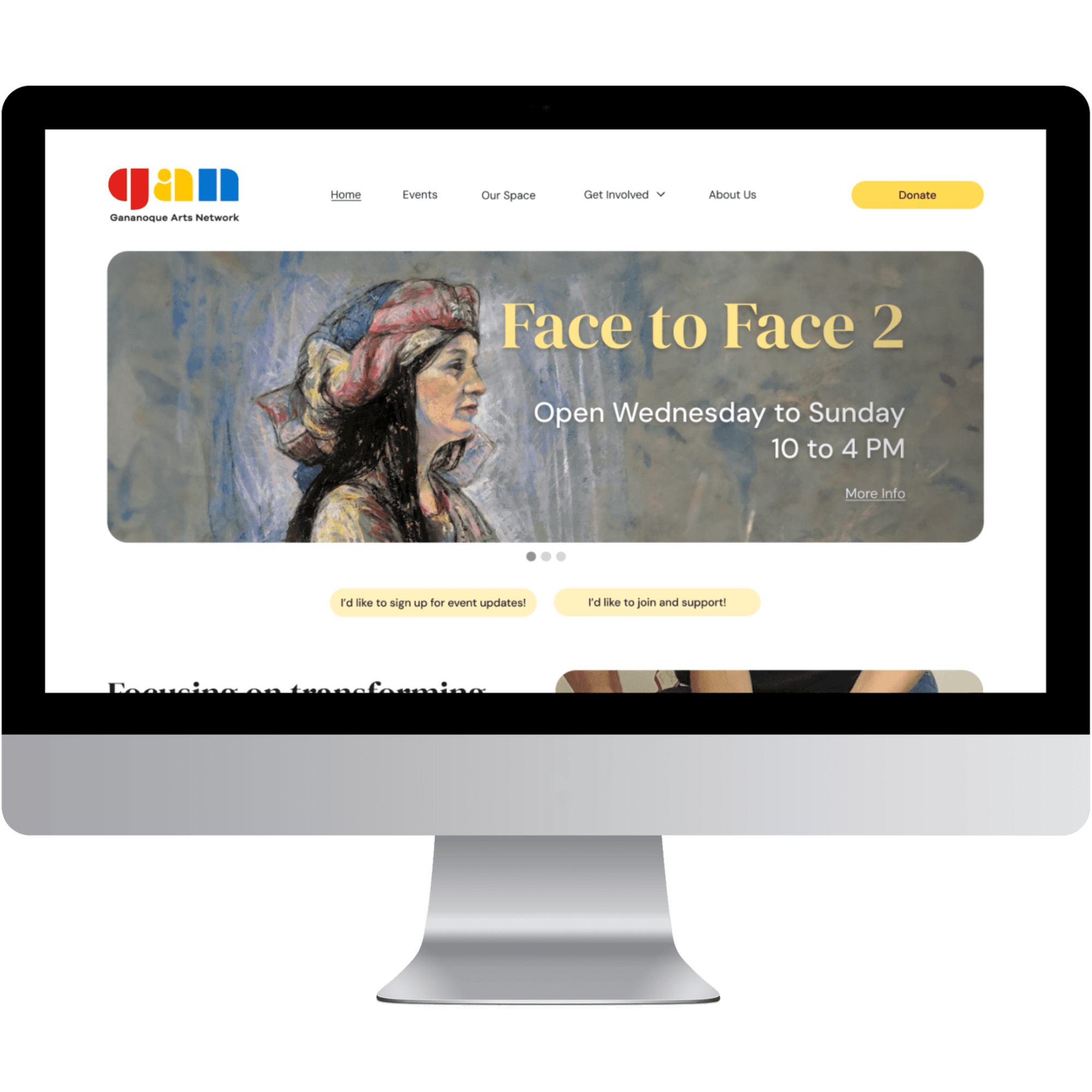
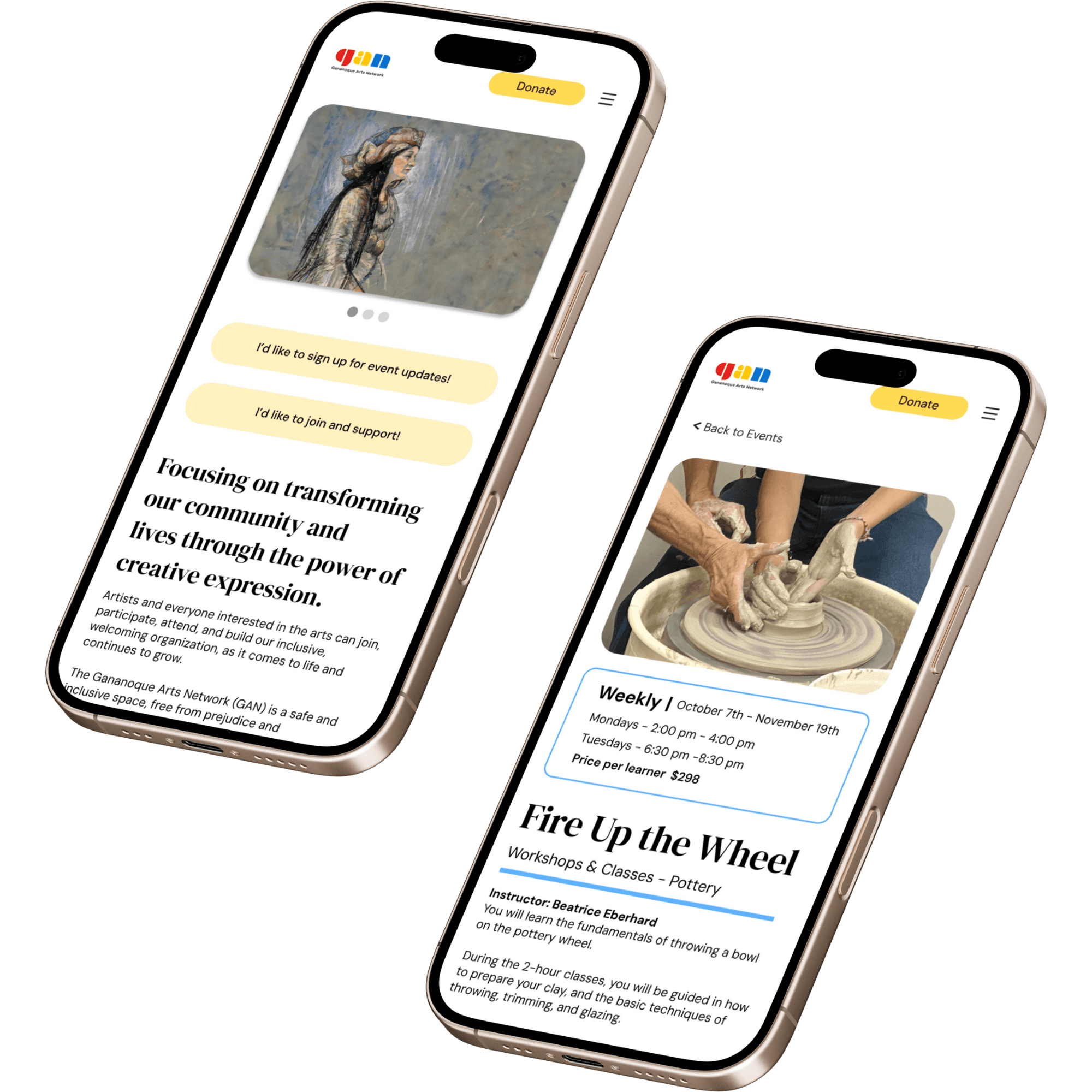
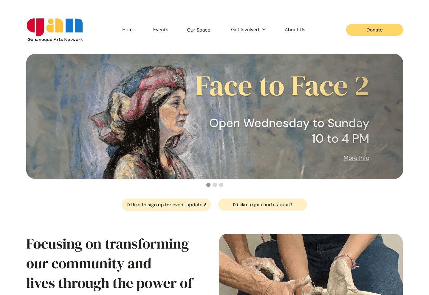
The redesigned GAN website makes it easier to find and register for events, featuring a well-organized events section and responsive design for seamless mobile access. Clear calls-to-action encourage user engagement and support for GAN’s mission, enhancing accessibility and strengthening community connections.
Client
Gananoque Arts Network
TEAM
Team of 4
Role
Lead Designer
Tools
Figma,
FigJam,
Trello,
Google Forms
Overview
Process


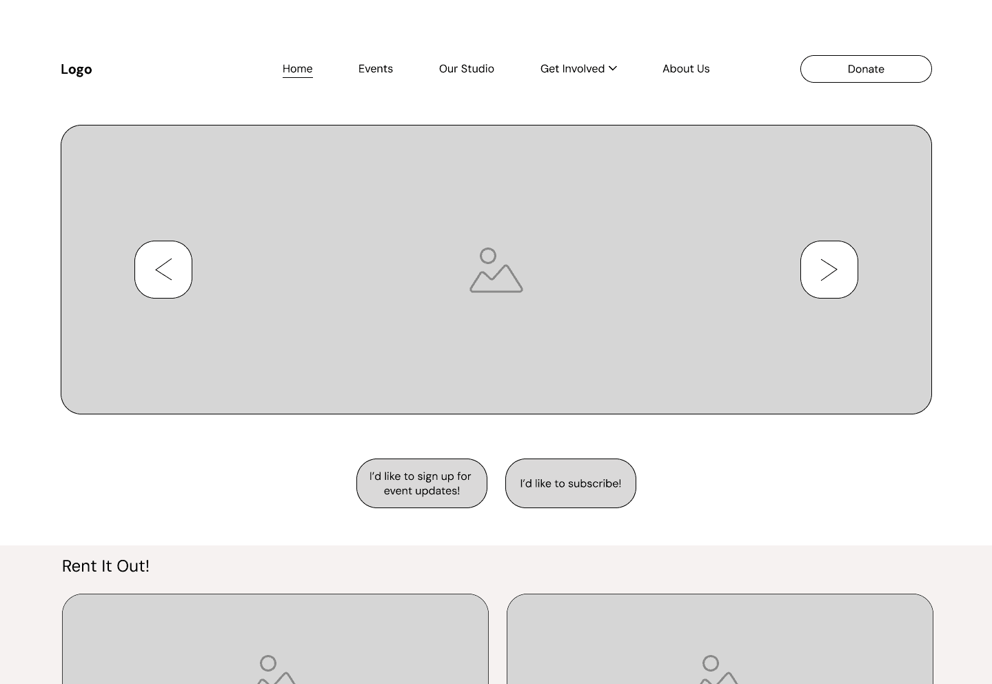
Old Website vs. Low-Fi & Hi-Fi Redesign
Level 1
Empathize
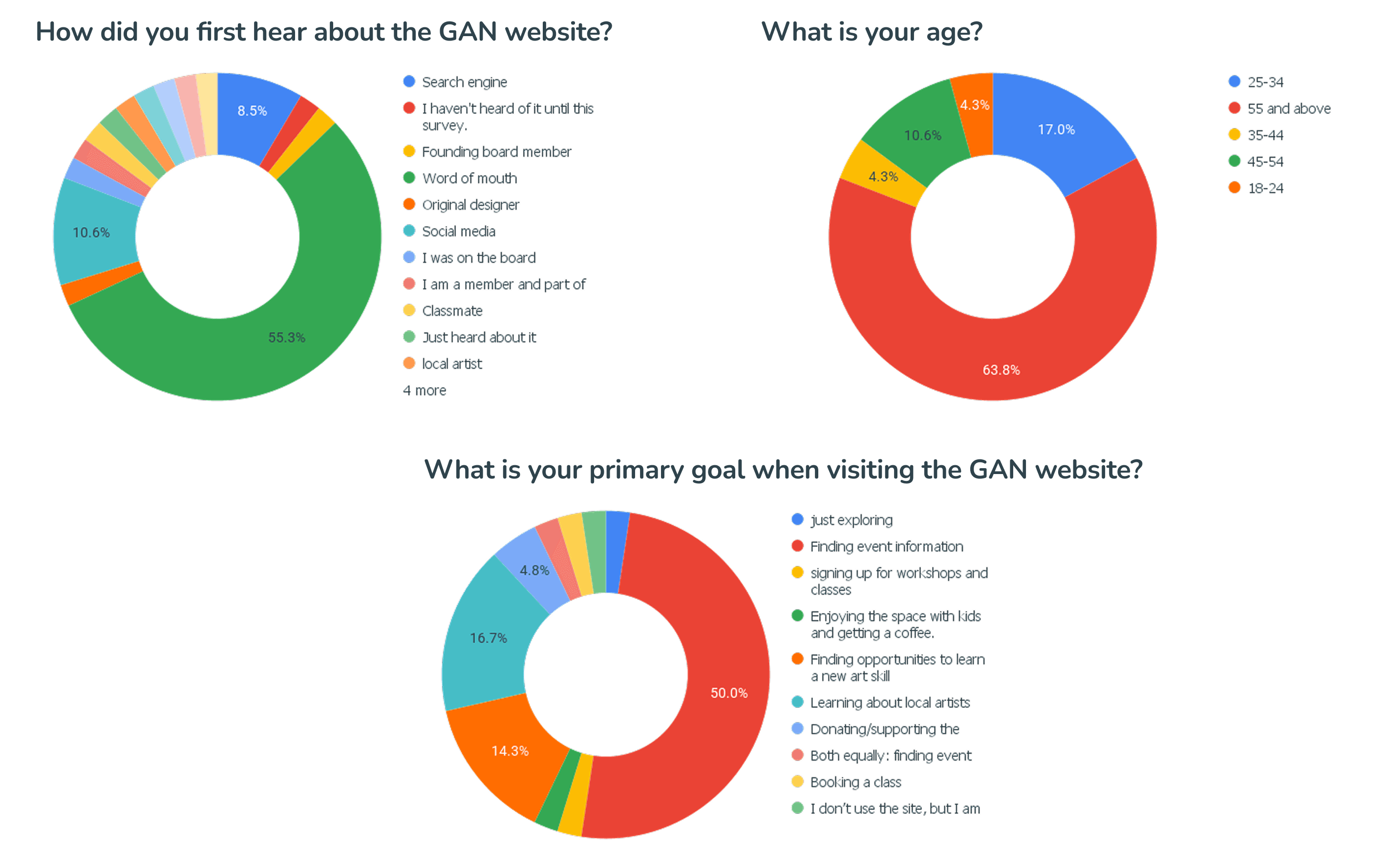
Our survey highlighted that most GAN Arts users are older adults (63.8% aged 55+) who find the site through word of mouth (55.3%). Their top goal is locating event information (47.7%), followed by learning about local artists and exploring art-related learning opportunities. This insight drives our focus on creating a simple, accessible design with prominent event and artist sections, ensuring a user-friendly experience for this dedicated community of art enthusiasts.
Level 2
Define
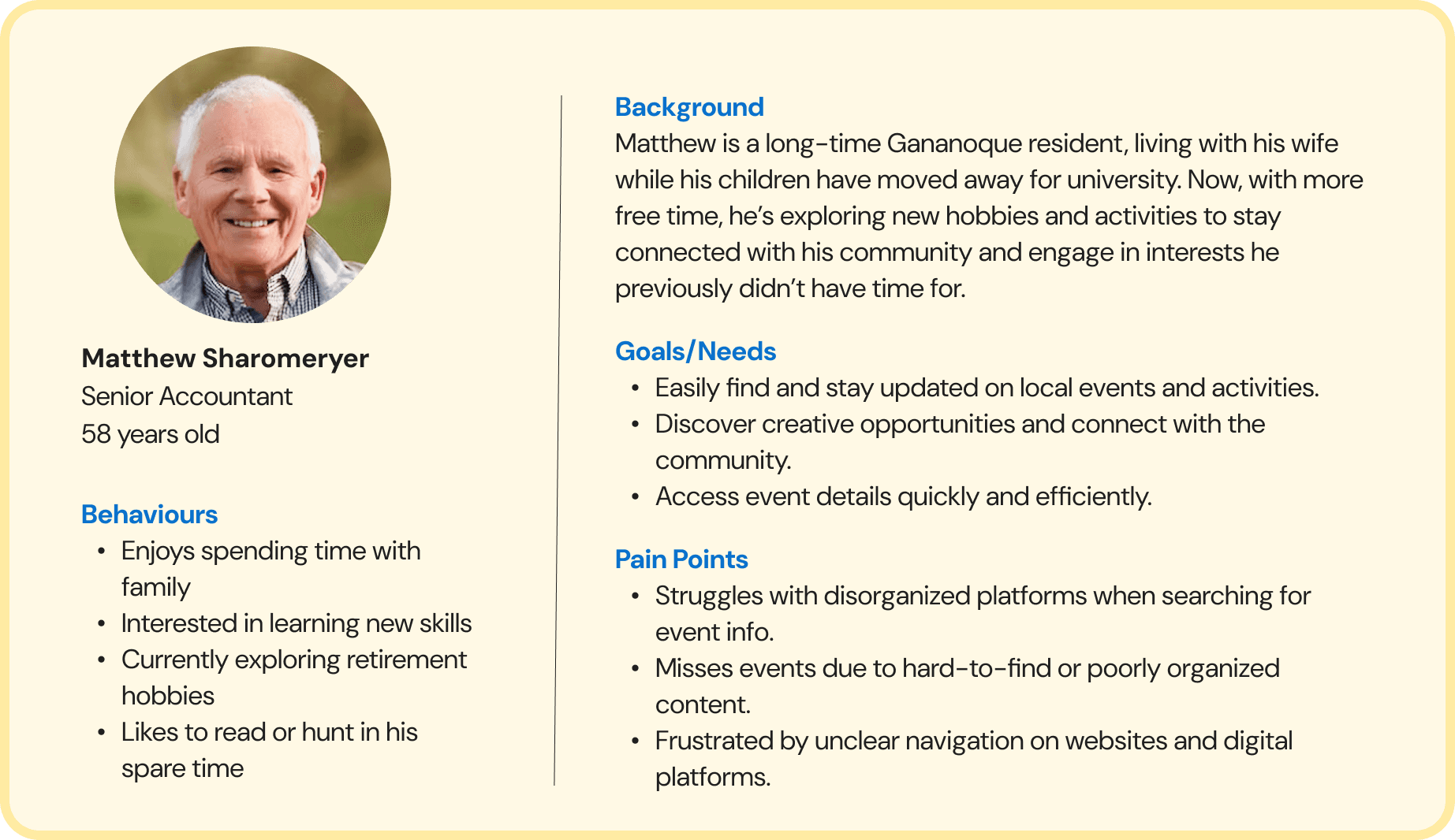
Matthew, a 58-year-old senior accountant, is eager to explore local events and new hobbies as he transitions into retirement. He needs a clear, organized platform to easily find event details and connect with his community. Currently, he’s frustrated by cluttered websites and hard-to-find information. A streamlined, user-friendly GAN Arts site would meet his needs and support his engagement with local arts and activities.
A problem statement was also formed:
As an art enthusiast, I want to easily find events and updates on the GAN Arts website so I can stay informed and attend the activities I’m interested in. But I struggle to navigate the site effectively because the event information is not prominently displayed and lacks clear organization.
View User Journey Map

Level 3
Ideate
Our redesigned navigation simplified the website by reducing primary categories from eight to five, making it more user-friendly and intuitive. We logically grouped related items, such as studios and galleries under “Our Studio” and all engagement opportunities under “Get Involved.” We also made a dedicated “Donate” button that provided a clear and prominent call-to-action. The new structure eliminated redundancy, used straightforward labels, and created a flatter hierarchy, enabling faster access to key sections like events, volunteering, and job opportunities. By aligning with user goals and improving clarity, our redesign enhanced usability, reduced confusion, and offered a modern, scalable solution tailored for our audience.

Level 4
Test
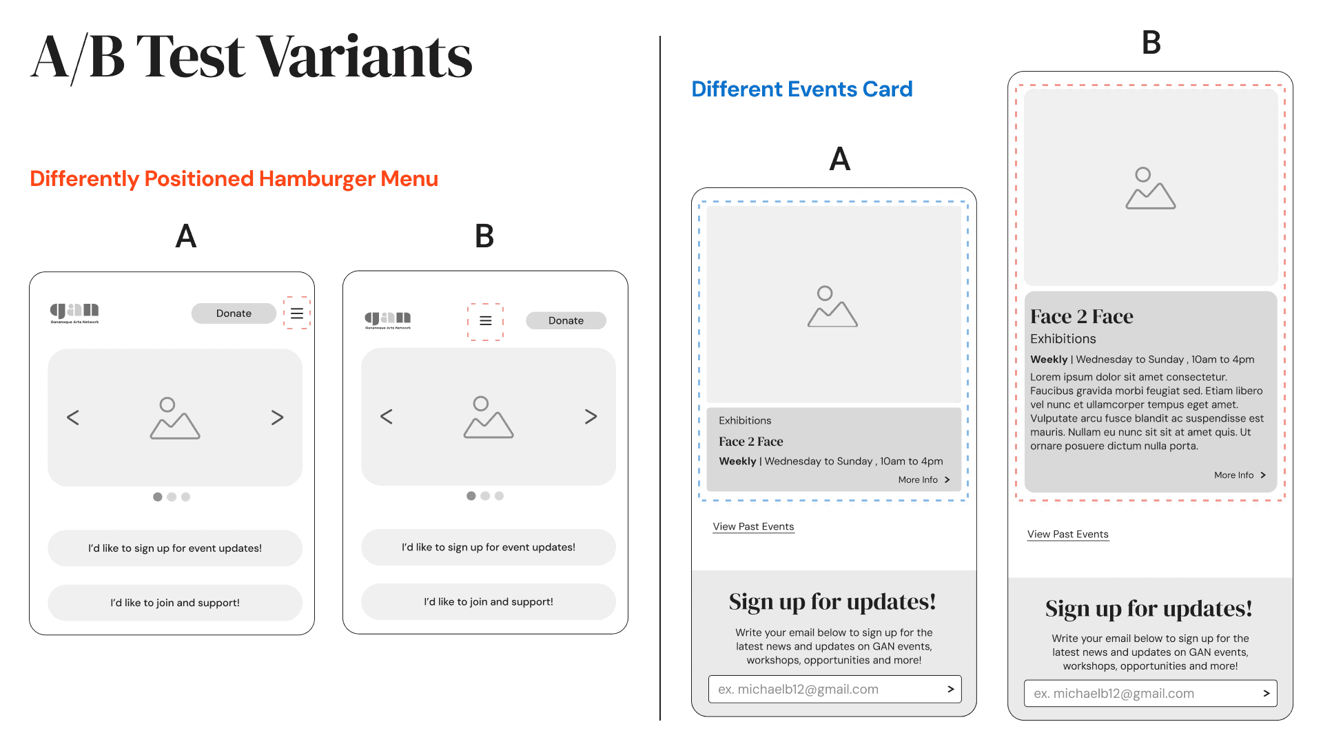
Test Focus: User preferences for the placement of the hamburger menu and the design of the events card.
We found that:
Hamburger Menu Positioning
Variant A (right position of menu): Preferred by users for its convenience.
User Feedback: The right positioning was noted as more accessible, improving overall navigation.
Events Card Design
Variant A: Users favoured this version due to the concise amount of information provided.
User Feedback: The balance of information was seen as optimal; too much detail could lead to overwhelming users.
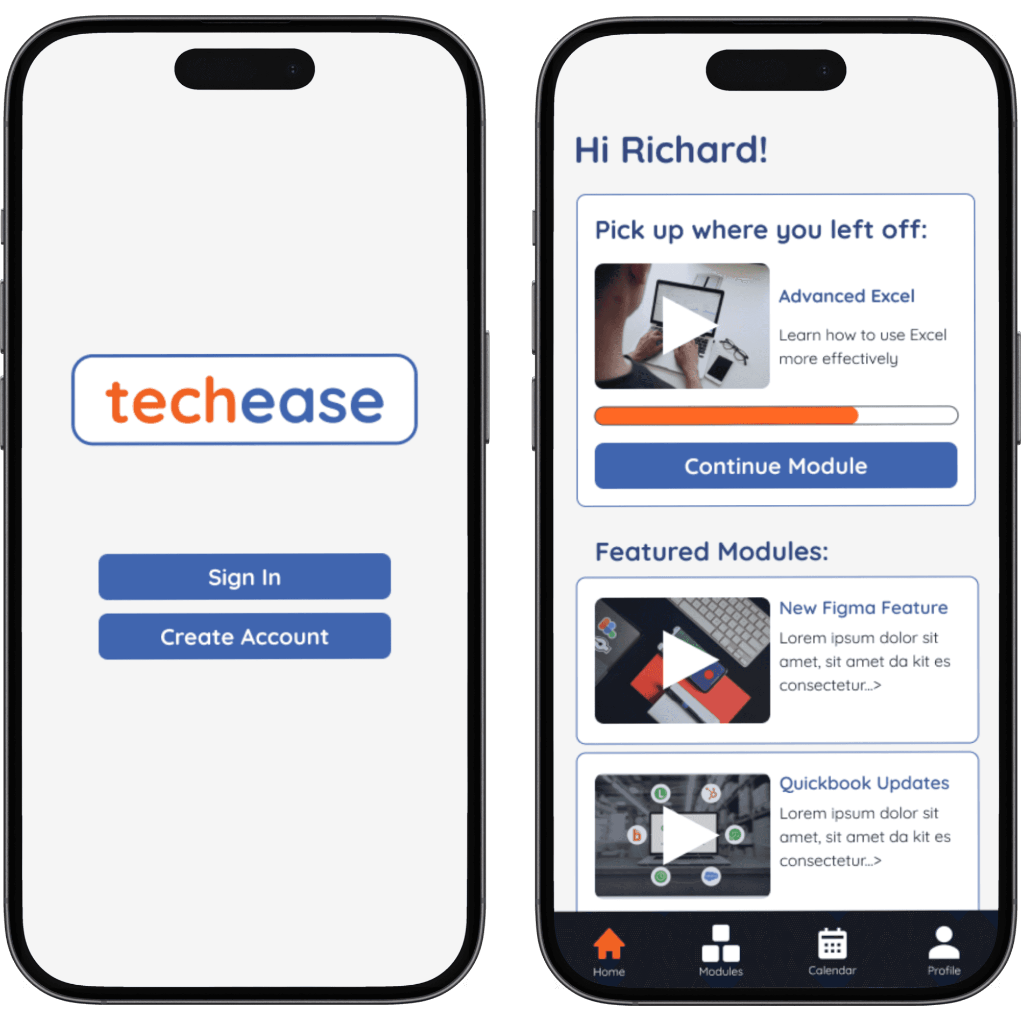
To align with user goals, our A/B testing focused on improving the events section to simplify navigation and enhance accessibility, particularly for elderly users. For Matthew’s task—finding event details for October 21, including registration and materials—we tested variations designed to streamline the process. These included a homepage carousel of upcoming events with a clear call-to-action button, a detailed event description page, and short summaries on event cards to prompt further exploration. The test evaluated the ease of searching, browsing, viewing details, and registering for events. By decluttering the events section, we aimed to improve user experience, engagement, and data collection for GAN.
Level 5
Prototype
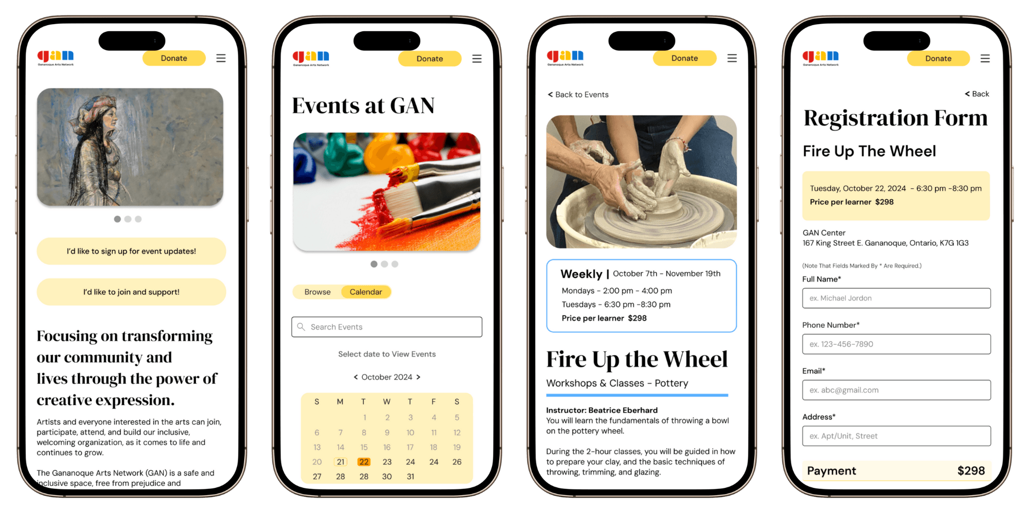
Our prototyping process addressed navigation challenges by streamlining access to event information, ensuring it was prominently displayed and organized under intuitive categories (with the help of the feedback from our A/B testing). This redesign allowed art enthusiasts like Matthew to easily find updates, discover creative opportunities, and stay connected with the community. By improving clarity, reducing frustration, and enhancing efficiency, the new design ensures a smoother user experience. As a result, Matthew can quickly access event details, stay involved with local activities, and enjoy a more engaging interface. Key benefits of this redesign include better search engine optimization, increased conversion rates, improved customer retention, cost-effectiveness, enhanced navigation, easy accessibility, and a more user-friendly experience.
View Hi-Fi Mobile Prototype
View Hi-Fi Desktop Prototype

Reflection
Collaboration with the NPO
Our redesign project for the nonprofit website greatly benefited from collaboration with the NPO. By establishing a strong partnership, we gained valuable insights into their goals and audience needs through initial meetings and regular feedback sessions. This open communication ensured our designs aligned with the NPO’s vision and fostered a shared sense of purpose.
Lessons Learned and Importance of User-Focused Design
A key lesson learned was the importance of user-focused web design. By prioritizing end-user needs, we created a more engaging and accessible experience that improved site interaction. We also recognized that a well-structured website enhances usability. Streamlining navigation allowed users to easily access critical information, further improving their experience.
Prototyping and Its Role in Design
Prototyping was essential in our design process, helping us visualize concepts and gather early feedback. This approach facilitated effective communication within our team and allowed us to refine our ideas based on user input. Overall, this project emphasized the importance of collaboration, user-focused design, and a solid website structure in creating meaningful digital experiences.